
1. Goal
To modernize the visual design (UI) and streamline the core user flows (UX) of the existing Indian Railway ticket booking application, making it more intuitive, faster, and visually appealing for millions of daily commuters.

2. The Problem
Existing railway booking applications are often criticized for their dense information architecture, outdated aesthetics, and complex booking funnels, leading to user frustration and high drop-off rates.
3. UX Pain Points
| Area of Failure | Observation & Impact | Design Outcome |
|---|---|---|
| Information Overload & Visual Clutter | The home screen and search results pages often display too much text, small fonts, and many links simultaneously. | Users are overwhelmed and frustrated. |
| Terminology & Jargon | Use of railway-specific abbreviations without explanations. | Users are confused and forced to use external search. |
| Visual Design & Contrast | Inconsistent design elements and insufficient contrast. | Poor accessibility and discoverability. |
| Post-Booking Experience | Poor management of existing bookings and live status. | Users rely on third-party apps. |
4. Design Strategy
Card-based Modern UI. A clean, card-based interface with strong focus on discoverability, clarity, and speed.
Core Implementation Principles:
- → Direct access to frequent actions on home screen.
- → Scannability through bolding and color coding.
- → Action-oriented CTAs and simplified booking flow.

5. Style Guide
A comprehensive visual system that ensures consistency and establishes a modern, trustworthy brand identity.
Color Palette:
Typography Hierarchy:
H1 - Main Heading
H2 - Section Heading
H3 - Subheading
Body Text
6. UI Execution
Component Discipline and Optimized Contrast. Execution focused on disciplined component styling and utilization, guaranteeing instant scannability and high accessibility across all screens.
- → Cluttered Home Screen: Introduced dedicated quick-action tiles on the Home Screen.
- → Complex Booking Flow: Consolidated primary search inputs and used card-based train selection.
- → Repetitive Data Entry: "Saved Passengers" feature centralized in Profile section.
- → Difficult Comparison: High-contrast train cards for easy scanning of key details.
- → Slow Authentication: Added Biometric Login and Aadhaar authentication options.

7. Interactive Screens
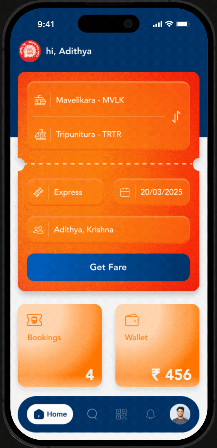
Home Screen
A high-contrast, streamlined home screen focused on immediate ticket search and quick access to essential services.
8. Impactful Results
The redesigned UTS app transforms a traditionally complex booking experience into a modern, fast, and delightful platform, significantly improving user satisfaction and booking completion rates.
01
Faster Booking Flow
02
Improved Scannability
03
Higher User Satisfaction